

OFFICIAL LOGO RELEASED - 2021 RELEASE CONFIRMED
.thumb.jpg.47097e0d381a1431b048763a32faef35.jpg)
-
Stay Connected


-
Forum Topics
-
-
News items
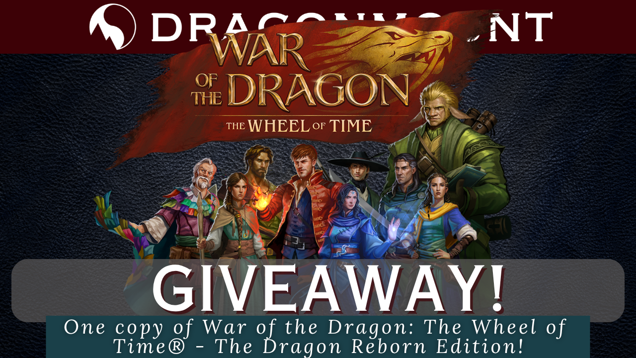 Giveaway of War of the Dragon: The Wheel of Time® - The Dragon Reborn Edition and Padan Fain Reveal!
An opportunity to win a War of the Dragon: The Wheel of Time® - The Dragon Reborn Edition and a Padan Fain miniature reveal!
Read More... -
-
Support Dragonmount Get exclusive content on our Patreon. Don't miss out.


Recommended Posts
Join the conversation
You can post now and register later. If you have an account, sign in now to post with your account.
Note: Your post will require moderator approval before it will be visible.