


-
Stay Connected


-
Forum Topics
-
-
News items
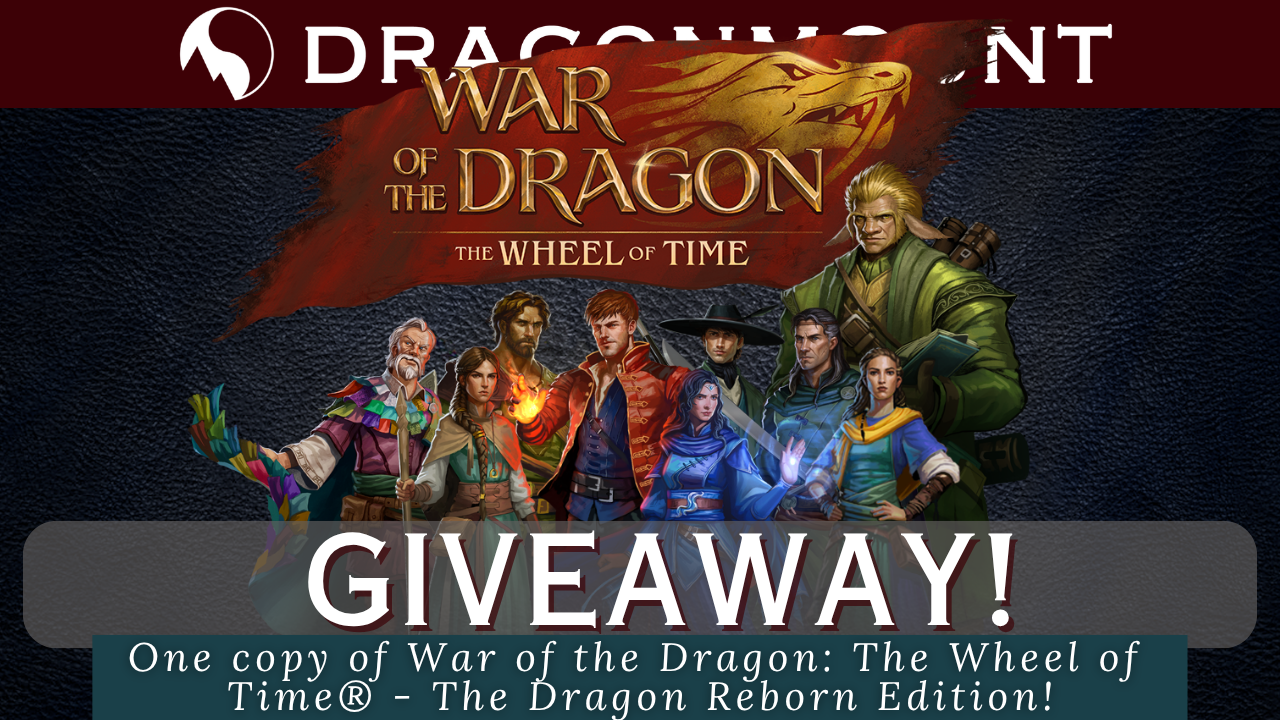 Giveaway of War of the Dragon: The Wheel of Time® - The Dragon Reborn Edition and Padan Fain Reveal!
An opportunity to win a War of the Dragon: The Wheel of Time® - The Dragon Reborn Edition and a Padan Fain miniature reveal!
Read More... -
-
Support Dragonmount Get exclusive content on our Patreon. Don't miss out.


Recommended Posts
Archived
This topic is now archived and is closed to further replies.