


-
Stay Connected


-
Forum Topics
-
-
News items
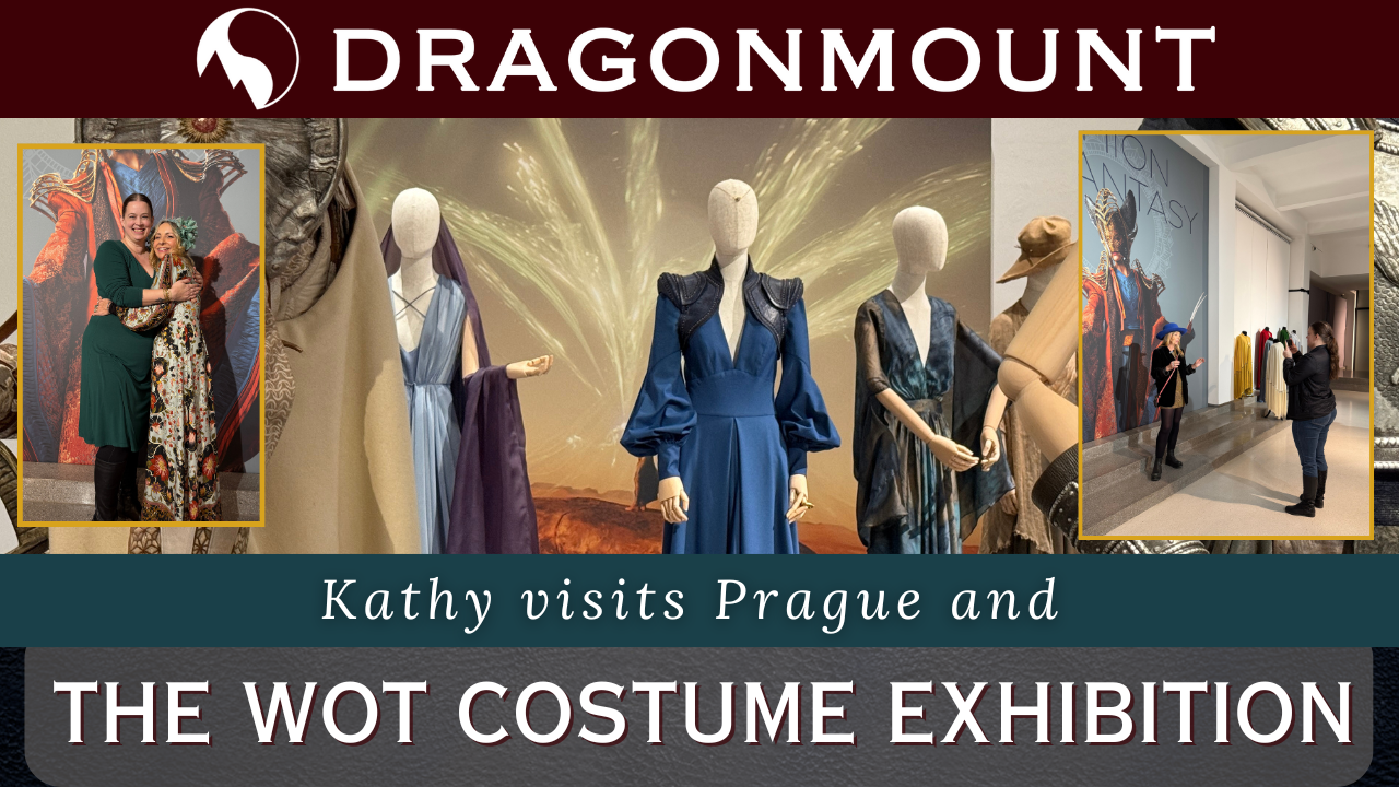 Fashion & Fantasy: The Wheel of Time Costume Exhibition
The Wheel of Time costume exhibition at Prague's Galerie Manes showcases over 80 breathtaking costumes, offering an unprecedented look at the intricate craftsmanship behind the show.
Read More... -
-
Support Dragonmount Get exclusive content on our Patreon. Don't miss out.


Recommended Posts
Archived
This topic is now archived and is closed to further replies.