Jump to content

DRAGONMOUNT

A WHEEL OF TIME COMMUNITY

A Memory of Light Cover Art


Jason Denzel

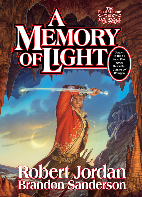
Tor Books has revealed the official cover art for A Memory of Light, the fourteenth and final Wheel of Time novel.

Click the image shown here for a larger version, or click here for the full resolution version where you can see Rand in all his 300 dpi glory.

The artwork is by renowned artist Michael Whelan. Mr. Whelan was commissioned to do this cover after Darrell K. Sweet passed away. He will be the Guest of Honor at next year's JordanCon V convention.

So, what do you think of the cover? Rand looks pretty awesome, huh? Tell us what you think in the comments below!

A Memory of Light will be released in hardcover and audiobook on January 8, 2013. The eBook will be released a few weeks after that.

Here's the full wrap-around image:

AMOL_full_cover.jpg

Links and other info


Please consider pre-ordering the book through one of our international Amazon affiliates, and help support our website.


User Feedback

Recommended Comments


Agreed. It's Alivia and Nynaeve in a circle with Rand so that he can safely wield Callandor.

Share this comment


Link to comment
Share on other sites

The woman in blue could be Moraine, but I don't think the woman on the right is Nynaeve - no braid.

Share this comment


Link to comment
Share on other sites

L-O-V-E-I-T-!-!-!-!


Here are few points, though:

Is that an eclipse I see? (twice-dawning day?)

It can't be cloudcover; you can see most of the outline of the sun.


Speaking of clouds, I thought Rand pushed them away, or is it just those caused by the Dark One, or is his effect negated by Bore, in which case, where are the clouds, or do the effects of the DO and Rand negate each other?


Anyway, I believe that the two women are Alivia and Moiraine.

- Alivia for 'helping Rand die' (frankly, if he is to die at Shayol Ghul, isn't everyone seeking to see him there guilty of helping him to die?)

- Moiraine for some theory I read a while ago.

Share this comment


Link to comment
Share on other sites

IMO it looks fake. And by that I mean it doesn't feel like the WoT to me. It looks like 3 people in a cavern with no feeling. My least favorite cover by far. I don’t say this for loyalty for Sweet. His covers may not have been the most appealing of styles but when i saw them all I could see is the feeling and mood of the book. This looks like one of my wife’s romance novels with no feeling.


Just my opinion.

Share this comment


Link to comment
Share on other sites

if i had to take a guess i would say that the women would be nynave adn alivia. they are the ones supposed to help. we recall that alivia will help him die. tho i may be worng.....thats the beauty of a guess tho. sad to see the end but the reread will be worth it!

Share this comment


Link to comment
Share on other sites

personally for me,the wheel of time story was always rand's story.

i made rand a promise around 1995,that i will follow his journey to the very

end no matter how many years it will take.

so for the last leg of this amazing journey i prefer the watch rand standing

and fighting,not placed on a bier and covered with a burial shroud.

seeing rand here,on a full heroic mode fighting the dark one,fills my heart

with gladness-thank you michael whelan.

Share this comment


Link to comment
Share on other sites

I know a lot of people dislike/hate DKS art. I for one am no fan of his work even though I like the previous WoT covers, much better than the European covers. Still, this saddens me and the style doesn't fit the series at all. I'd rather have the unfinished DKS cover than this one, which isn't nothing like the rest. Sad, sad way to end the series.

Share this comment


Link to comment
Share on other sites

LOVE IT! (Especially the sky and the hilt of the Dragon Sceptre)


Three Points:


1 Im stunned at the number of ''not near as good as Sweets'' posts. To say they seem slightly disingenious after all the years of bashing Mr Sweet...Weeeeell...Instead of a Hit and Run post just saying ''not near as good as Mr Sweets'' how about supporting that? Do you feel Mr Sweet's use of perspective, color, proportion, detail etc are better? Anyone who knows anything about art knows that Whelan's color blows Sweets away. Appreciation for art can be subjective but the fundamentals are concrete. Use of color, proportion, etc. Mr Whelan is far superior.


2 Nynaeve chopped her hair off in TOM so there is no more ponytail. Also, Sisters dont wear entire cdresses matching their Ajah's color so the yellow dress isn't that big a clue. More telling would have been a green dress with a yello shawl or yellow-fringed trim.


3 I dont see a blue gem in Mr Whelan's drawing. Im not convinced that is Moiraine.

Share this comment


Link to comment
Share on other sites

To the people thinking that Alivia is in the cover, note the following from Tor's excerpt accompanying the cover release:


Here, Rand stands with Callandor on the rocks of Shayol Ghul, heading down into its depths to confront the Dark One even as the sun itself vanishes from the world. Two Aes Sedai follow the Dragon Reborn into the mouth of darkness, two women who have been with Rand since the very beginning.


Definitely Moiraine and Nynaeve if there was any real doubt.

Share this comment


Link to comment
Share on other sites

Is the other girl Min? I think she is the only girl with short hair in can think of, and she has been wearing dresses recently

Share this comment


Link to comment
Share on other sites

Regarding the two women:


Tor website says they've been with Rand from the very beginning. The one in blue has gotta be Moiraine. Odds are the other is Nyn, although I don't remember her with short hair in the books. Maybe she saw a stylist in the Borderlands?

Share this comment


Link to comment
Share on other sites

It's definatlly Nyneave and Moiraine (I think), maybe Nyn got her braid hacked or burnt off?


I wish i could have this cover instead of the UK one, its awesome. Though god knows why Rand is holding his sword like that :P

Share this comment


Link to comment
Share on other sites

It's so perfect if it is Nynaeve and Moiraine. After all the times Nynaeve said she was going to get back at Moiraine. Working together to help Rand, the Dragon Reborn, is just simply satisfying. That's what I want this book to be: completely and utterly satisfying to the series as a whole. I'm a huge fan of Michael Whelan so of course I love this cover.


There's plenty of emotion in both covers, maybe Sweet's a bit more. Rand has to grace the cover because it really is his story. The fighting pose doesn't seem odd to me because it's the last stand against the Shadow and Rand wants to end it here.

Share this comment


Link to comment
Share on other sites

I approve.


I think Whelan made it match Sweet's style on purpose. I can't put my finger on exactly how, but it fits well in with the old Sweet covers in a way I would not have expected from Whelan.

Share this comment


Link to comment
Share on other sites

It must be Moiraine. But it is a shame if he didn't get her height right. I don't think there's many women of similar height to her.


Could the other one be Lanfear 2.0?

Share this comment


Link to comment
Share on other sites

Hmm, must have missed the text that was released with the painting. That would have simplified things before everyone started commenting...I tried zooming in on the page, all the way up to 400%, and it looks like there really is no blue jewel, as someone mentioned above. On the other hand, it's a little hard to tell, but it looks like there actually may be a dot on the forehead of the women in yellow...a ki'sain, maybe? And I seem to recall Nynaeve's braid being singed off at one point, though I could be wrong.

Share this comment


Link to comment
Share on other sites

I don't know how anyone can thing that this looks like a romance novel. After Lord of Chaos, which really really does, this is no comparison. Like it or not, that's everyone prerogative but romance novel? Not even close.

Share this comment


Link to comment
Share on other sites

I approve.


I think Whelan made it match Sweet's style on purpose. I can't put my finger on exactly how, but it fits well in with the old Sweet covers in a way I would not have expected from Whelan.

I saw this as well and think it's spectacular. I also like that Rand is looking straight at us. Without having the other covers handy, I seem to recall that most of them (US at least) don't have the protagonists looking at the reader.


As for the comment about wishing Callandor could look the same as on the cover or TDR, I do have that book handy and although the sword is glowing, the guard looks similar, and removing the glow from it would give a standard slender sword like in the Whelan cover. Love it!

Share this comment


Link to comment
Share on other sites

nyn even shows with short hair, it got cut off in her test. deffinately makes it look like it will be moir and nyn at shadar logoth.

Share this comment


Link to comment
Share on other sites

Is the other girl Min? I think she is the only girl with short hair in can think of, and she has been wearing dresses recently

nyn has short hair, her braid was cut off in her test.

Share this comment


Link to comment
Share on other sites

IMO it looks fake. And by that I mean it doesn't feel like the WoT to me. It looks like 3 people in a cavern with no feeling. My least favorite cover by far. I don’t say this for loyalty for Sweet. His covers may not have been the most appealing of styles but when i saw them all I could see is the feeling and mood of the book. This looks like one of my wife’s romance novels with no feeling.


Just my opinion.


I hate to ask if you have read all the books to this point but I hope you have. No feeling is what Rand embodies in his path to the Last Battle. And for me this gives me more inspiration for my almost complete death metal Wheel Of Time Album. And of course this is my opinion my friend!

Share this comment


Link to comment
Share on other sites

For the most part I like this cover. However, the way Rand is holding his sword is one of the most ridiculous things I have ever seen. It's fairly common place in fantasy art, I suppose, but I do wish that they would portray how someone would actually hold a sword in fantasy art instead of holding it in a way that looks "cool". Those types of very un-realistic things have a tendency to bring me out of my suspension of disbelief, which annoys me.


I agree though that it is Morainne and Nynaeve though. Things are coming full circle baby! It's time to end this! In EPIC fashion.

Share this comment


Link to comment
Share on other sites


Join the conversation

You can post now and register later. If you have an account, sign in now to post with your account.
Note: Your post will require moderator approval before it will be visible.

Guest
Unfortunately, your content contains terms that we do not allow. Please edit your content to remove the highlighted words below.
Add a comment...

×   Pasted as rich text.   Paste as plain text instead

  Only 75 emoji are allowed.

×   Your link has been automatically embedded.   Display as a link instead

×   Your previous content has been restored.   Clear editor

×   You cannot paste images directly. Upload or insert images from URL.


×
×
  • Create New...