


-
Stay Connected


-
Forum Topics
-
-
News items
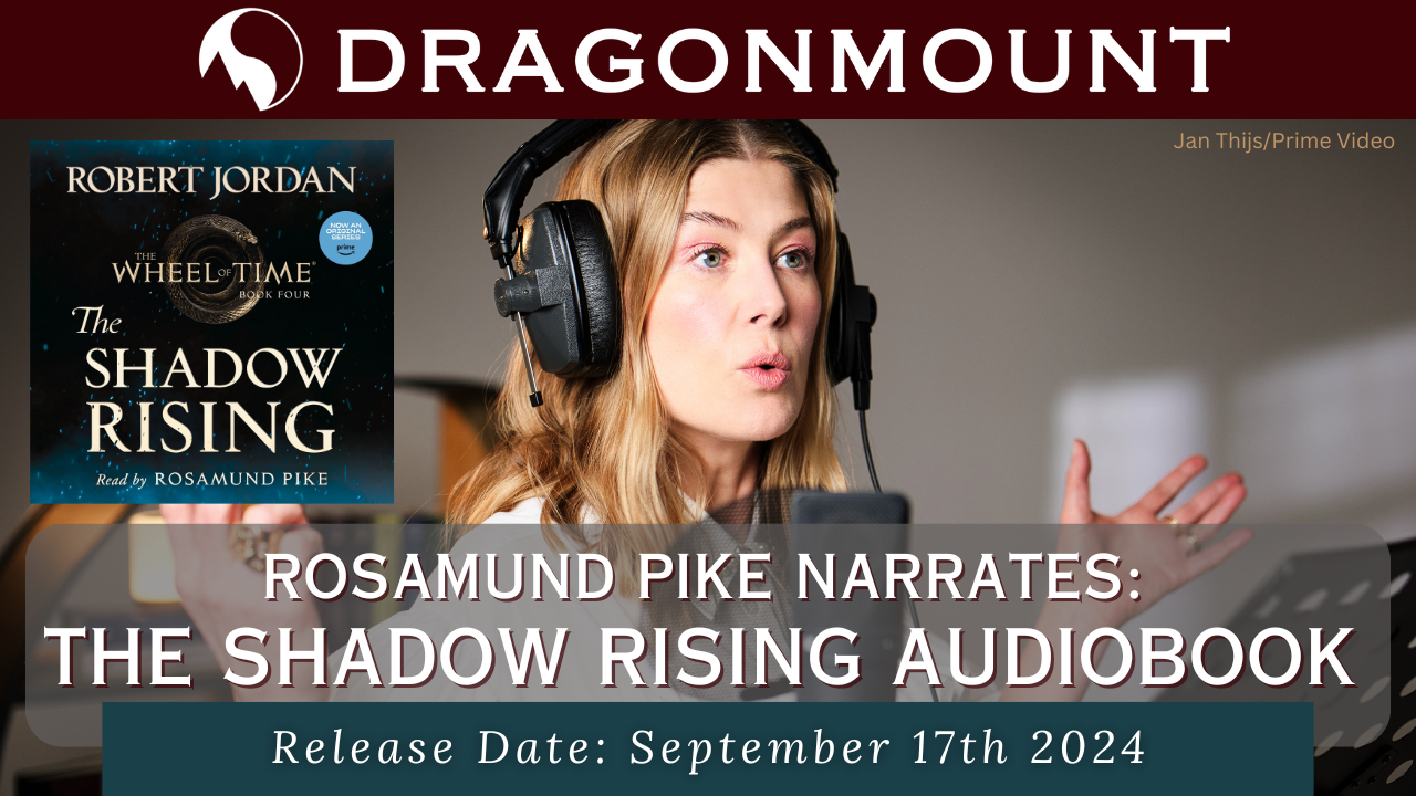 The Shadow Rising Audiobook read by Rosamund Pike will be released in September 2024!
The fourth book in the Wheel of Time series narrated by Rosamund Pike is available to preorder now!
Read More... -
-
Support Dragonmount Get exclusive content on our Patreon. Don't miss out.


Recommended Posts
Join the conversation
You can post now and register later. If you have an account, sign in now to post with your account.
Note: Your post will require moderator approval before it will be visible.