Jump to content

DRAGONMOUNT

A WHEEL OF TIME COMMUNITY

Wheel of Time Playing Cards and "Tarmon Gai'don" Poster Available at Ta'veren Tees


Dwynwen

The official Wheel of Time playing cards you have eagerly anticipated are finally here! Our pals at Ta'veren Tees have these cards, plus a lovely "Tarmon Gai'don" poster for sale. Both the cards and the poster feature the spectacular artwork of Ariel Burgess. Check out the press release below for complete information:

_____________________________________________________


“3 Editions of Wheel of Time Playing Cards Decks now available for Pre-Order and never before seen ‘Tarmon Gai’don’ Poster by Ariel Burgess”

Ta’veren Tees is excited to announce the “Wheel of Time Playing Cards Decks”, featuring the artwork of Ariel Burgess, are available as of December 25 for pre-order at www.TaverenTees.com/novelties.

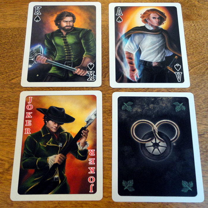
For The Wheel of Time®, Robert Jordan created thousands of unforgettable characters – both good and evil – that fans have come to know and love. The Wheel of Time® Playing Cards bring over 60 characters to life through the breathtaking art of Ariel Burgess and are an essential addition to any WoT fan’s collection. Every card features a different character or characters from the series.

A portion of the proceeds from each edition sold will be donated to Mayo Clinic to fund research on Amyloidosis, the rare blood disease that claimed Robert Jordan’s life in 2007.

A complete list of characters included in the deck can be found at www.TaverenTees.com/cardlist

Pre-orders begin shipping January 10th, 2013. All items purchased in the same order as the “Wheel of Time Playing Card Decks” will be held and shipped at the same time.

Ta’veren Tees is pleased to offer 3 Editions of the Wheel of Time playing cards.

___________________________________________________________________________

Posted Image

Standard Edition: The Wheel of Time® Playing Card”

The “Standard Edition: The Wheel of Time® Playing Cards” contains 54 cards, including two jokers, in a single deck box.
________________________________________________________________________

Posted Image

“Collector's Edition: The Wheel of Time® Playing Cards”


The “Collector's Edition: The Wheel of Time® Playing Cards” comes in a double deck box, with a character list and two individually wrapped 54-card decks, so you can play with one and display the other! The Collector’s Edition is limited to 500 units.
_______________________________________________________________________

Posted Image

“Limited Edition: The Wheel of Time® Playing Cards”
The “Limited Edition: The Wheel of Time® Playing Cards” includes:
· 1 Standard Edition single deck box.
· 1 Collector’s Edition double deck box (with two 54-card decks and a character list)
· 1 Autographed 11 X 17 one of a kind character portrait.
The autographed character portraits are not available for sale except with the “Limited Edition:The Wheel of Time® Playing Cards.” Each of the 54 cards in the deck has been made into an 11 x 17 character portrait. There are exactly 54 of these portraits created and all have been signed by:
1. Ariel Burgess, Artist
2. Harriet McDougal Rigney, Robert Jordan's editor and widow
3. Maria Simons and Alan Romanczuk, Robert Jordan's assistants
Robert Jordan was a poker enthusiast, and in the spirit of poker, when you order a “Limited Edition” version of the playing cards, one of the 54 posters will be randomly selected and shipped to you separate from the rest of your order. You cannot specify which character you receive.

The Limited Edition is limited to 54 units.
_________________________________________________________________

med_gallery_107_151_159969.jpg

"Tarmon Gai'don" by Ariel Burgess.

Just in time for the Last Battle, Ta'veren Tees is excited to provide this stunning piece of new, NEVER-BEFORE-RELEASED artwork by Ariel Burgess titled “Tarmon Gai’don”. This 16" x 20" poster features Perrin, Rand and Mat as they are before A Memory of Light and the Last Battle. Add it to your art collection today!
To read more about Ariel Burgess, visit our Guest Artist page.


Ta’veren Tees is an officially licensed creator of Wheel of Time® merchandise. Find them online at www.TaverenTees.com, on Facebook at www.Facebook.com/taverentees, and on Twitter at www.Twitter.com/taverentees.


User Feedback

Recommended Comments

Pretty neat but wow Rand looks awful. Could easily be the face of a woman.


Neat otherwise!

Share this comment


Link to comment
Share on other sites

Wow, that last one of all three looks really familiar. Isn't it similar to that mock AMoL cover that was going around minus the addition of the gay character?

Share this comment


Link to comment
Share on other sites

Yeah, Rand's face looks more like a Victoria's Secret model than a half-mad dragon reborn. And what happened to Mat's scarf? Still, it's not like I could do better... still very well done.

Share this comment


Link to comment
Share on other sites

hey!if you don't have anything nice to say then don't say anything at all! i'd like to see your "better" officially licensed artwork!

Share this comment


Link to comment
Share on other sites

It's very rare for me to actually want to have fan paraphernalia for much of anything, but these playing cards are cool enough to be the exception to the rule.  Well done, Ms. Burgess!

Share this comment


Link to comment
Share on other sites

Okay, Ariel is being a kind, wonderful person, so I won't be.

She has been working on these cards, originally just as a "what if" idea, since way back in Feb 2011, and had her account on deviantArt, http://reddera.deviantart.com/, for over 4 years.  Ever since starting on the images on her Facebook page http://www.facebook.com/pages/In-Memory-of-Robert-Jordan/164127706972822, her intention was always listed as a hope something might happen to get the images made into a poker deck, since James loved to play Poker.


From the very start, she asked, even PLEADED, for input from fans.  I've been there since very nearly the beginning, constantly amazed at her talent and willingness to accept critiquing.  Perhaps if some of you had been more involved with what she was actually going through BEFORE the idea even had a hint of becoming reality, actually looked at the original line drawings and designs, maybe you'd have a different perspective.  How many of you remember Berelain's diadem looking like the eagle from Wonder Woman's costume?  Or when Moghedien looked like she was a runner up for playing Regina in "Once Upon a Time"?  How about when she was at a complete loss for what to do with the Aelfinn/Eelfinn, and EVERYONE was pitching in because no one had a real definite ideal of them in their minds.  What about when she floored us with her Mesaana/Danelle dual presentation?  (And I'll forever love her for using Goran Visnjic for Barid Bel (and those of you who know me KNOW I had to just add that in!))  Where were you guys when we tried convincing her that Robert Carlyle (as Rumpelstiltskin) was PERFECT for Fain?  What about when Rand looked like Hayden Christensen (<shudder>)?  When we had a Trolloc Teddy Bear, instead of the one we have now that actually LOOKS like the twisted blend of human and animal stock?  Or the glorious moment when Hopper was added to Elyas' card?

I can, literally, keep going.  At one point, she was simply creating the characters from her mind's eye, and then when it turned into "official" interest, she received the "list" of desired characters (and I'm still vocal about my disapproval of Rhuarc being ignored.)  Even through the increased pressure of an official commission, she was ever gracious and friendly, still constantly open to criticism and suggestions.  When the time came, she submitted the images for approval.  And, whether any of you like it or not, if HARRIET says "this is the way these characters look", I dare you to go up to HER face and tell her she's wrong.  Even after submission, Ariel was asked by TPTB to make changes for more accuracy, until each and every single one of the 54 cards passed the test. 

There are some of you complaining about accuracy, in which case I would point out that maybe you'd better read the books more carefully!

For instance: Mat's scarf was black up until he tries to sneak a visit in the rain to the Palace to see Birgitte in ToM, and he ends up using it to block a knife thrust, which shredded it (ToM, ch 22, "The End of a Legend".)  He still wears it until ch 31, "Into the Void", where he drops it in the middle of the Dusty Wheel (better known as the Rumor Wheel) because it has a hole in it, right before the final fight with the gholam.
And then, in ch 52, "Boots", he has gotten a new scarf, and deliberately chose RED in honor of Tylin and the others the gholam had killed (he even thinks to himself that he very briefly considered "pink"...VERY briefly.)

For those of you who are complaining that Rand is too "pretty", need I remind you who his brother is?  It's been stated constantly throughout the series the effect Galad's appearance has on ALL women...do you REALLY think his younger brother is going to be that much unlike him?  And even more significantly, how often did women throw themselves at him (before he became "harder"), talking about how handsome he was.  Look at Berelain's performance in the Stone in tSR, where she tells him how attractive he is.

And, last time I checked, he wasn't a "half-mad Dragon Reborn".  Some of you may have missed the end of tGS and didn't read ToM at all, or you would have known that issue has been resolved courtesy of the Fisher King/Rand Sedai effect.

And finally, the "comparison" to Dem888's "Tarmon Gai'don" (or should I say very thinly veiled accusation of copying).  Here are the two, together:

http://www.facebook.com/photo.php?fbid=2583777409356&set=a.1313934384074.34850.1702137269&type=3&theater

First, let's start with the Banners.  Now, it's pretty hard to argue about them: James was VERY specific about them in the books:
 
Perrin's Wolfhead is pretty straight forward, it's going to look similar.  

The Banner of the Band of the Red Hand is very distinctly stated as being a red, open hand (Ariel's certainly looks more like a hand to me, but maybe my hands are just shaped differently).  It also, VERY specifically, states that the Band's motto is on the Banner: if you look at Ariel's, near the rim of Mat's hat, you can see the motto plain as day.  It is NOWHERE on Dem888's.

The Dragon Banner is also VERY specific: if you look at the cover of PoD, Ariel's Banner is close enough to be acceptable without anyone being able to accuse her of stealing DKS's image.  The Dragon Banner, on Dem888's picture, is "letter-wise" rather than "landscape": the Dragon is supposed to be flying across the sky, not looking up at it like a statue.

From the banners to accessories:

I assume Dem888's Mah'alleinir has a leaping wolf on it (I mean, I can see some wavy lines that might be the shape of a wolf.)  You can't miss Hopper on Ariel's.

As far as Callandor goes, it's a crystalline-looking blade, slightly curved.  I must have missed the bluish tinge in the description somewhere...I know it's crystalline and all, but "blue" would have been mentioned somewhere...whereas, again, Ariel's appears a far more accurate depiction, based on the actual book descriptions.

Mat's Ashendarei has the most differences: there are two ravens on the blade...and ONLY two ravens.  I have no idea what Dem888 did with his blade...I mean, there COULD be a raven on there...somewhere.  The ravens on Ariel's are too light (yes, actual criticism!)  But the most important thing?  The INSCRIPTION is actually on Ariel's (we tried to get it in the Old Tongue, but there weren't enough of the words available.)

And finally, the appearance of our Ta'veren:

Perrin, in Dem888's version, looks like he should be screaming "This is SPARTA!" at someone.  Furthermore, his eyes are just WRONG.  Nynaeve very distinctly states, in tEotW, that the yellow only touches his irises.

Mat's (James Rigney's) hat is supposed to be BLACK.  PERIOD.  And for all you worried about Mat's scarf, up until the point mentioned above that takes place after the gholam is beaten, Mat's scarf is BLACK, not GREEN.  Oh, and Mat's coat was green from Ebou Dar until Thom buys him a new one in ToM before they leave to get Moiraine.  Not blue.  My final complaint (for now anyway)?  The knives.  Mat wears two lower leg knives in the top of each of his boots, not the insides of his thighs.  As far as I know, I've only ever seen women who are supposed to be "spies" or assassins wear a knife on the inside of their thigh, and usually under their skirt.  Not to mention the fact that four knives, set up the way Dem888 has them, would make walking rather...difficult...

Finally, there is Rand.  Rand with eyes that are supposed to be grey sometimes, other times blue.  Dem888 makes them ice blue (to match Callandor I suppose), Ariel gives the blue-grey  I don't know where Dem888 got his idea for Rand's outfit, it's very Imperialistic, suitable for the meet and greet with Tuon.  Ariel kept with the current, at-ease-with-himself Fisher King.  Also, Ariel's version has the Dragon belt Aviendha gave Rand, Dem888's does not (and Rand doesn't take it off except for bed...)

About the only thing I can say they agree on is the height...

So, who wants to "thinly veil" accusations of copying against Ariel?  She produced a piece that is factually accurate, per the given descriptions in the books (minus Mat's inscription not being in the Old Tongue.)

Don't get me wrong: I like Dem888's pic well enough for what it is.  I personally could not produce anything like either of these two people.  But I'm not going to just sit here while people bash Ariel's work, or even toss in "copying" remarks, after watching her bust her rear for the past two years to bring us something fantastic.

You guys don't like her work?  Don't buy it.  It's really that simple.


And since it's taken me such a ridiculous amount of time to write this, I'm certain I'll have more comments to make...

Share this comment


Link to comment
Share on other sites

Wow. Are you off your high horse? Here, let me get you a stool, that's a pretty big friggin horse.


I don't blame you for wanting to step in and defend the artist. At the same time, I don't think any of us were being malicious toward her in any way. Yeah, I may have been a little harsh in my judgment of Rand, but I was also sure to add that no, I can't do better, and it was a well done work.


You need to chill out. None of what anyone said deserved that lashing out. I didn't see anyone accuse her of copying dem888's picture. I saw comparisons being drawn. Hardly accusations of copying... any work like this, people will draw the main characters together, and there are bound to be similarities. Quit jumping to conclusions and jumping down peoples' throats.


And I'm sorry my "less informed" comments sent you into a rage. I haven't read tgs or tom since they first came out, and forgot the bits about the scarf.


----Edited out the bit at the end with the bad language. It was uncalled for, and I apologize for that, but I don't feel the need to apologize for the rest of this post. 

Share this comment


Link to comment
Share on other sites

I have to agree with Kristi.

I have been following Ariels work for some time now and am very happy with how she has brought characters that i love to life. I especially liked that she asked for fan feedback and took it into consideration and made the neccessary changes.


I really do think that we should appreciate what she has done and not critisize it.

What people can forget is that she wll be reading these comments and some of them are not very nice.


There will be similarities between any WOT art as all the artists are going by the descritpion of characters and events in the book. 


And really - if you dont have anything but critisizm then you should probably keep it to yourself and let the people who love this artists work enjoy it!


Share this comment


Link to comment
Share on other sites

And I do agree that some of us were too quick to criticize, and she has every right to step up and defend Ariel. I applaud her for that. But the way she went about it was absolutely uncalled for. Two wrongs don't make a bloody right.

Share this comment


Link to comment
Share on other sites

I would have to disagree with you on that. She defended an artists that she has been working closely with. And i dont think that she went about it the wrong way. She was very methodical and went over every point. I have to say that i am not impressed with the way that you reacted to her post. 'high horse and looked like a .... doing it' I appreciate that the internet is a forum for expression but there are people that get hurt by these comments...

Share this comment


Link to comment
Share on other sites

I'm sure she'll be fine. She doesn't seem like the type to get hurt by some guy that took offense to her ripping the rest of us a new one. Either way... we can agree that Ariel did a good job, and I suppose that's all that matters. I will buy the deck as soon as I can, because i love the Wheel of Time and everything about it. I stated my opinion on her depiction of Rand more harshly than I'd intended, and I apologize. Like i said... I can't do any better, so I may as well have not said anything.

Share this comment


Link to comment
Share on other sites

@Kristi Deming

I give you a standing Ovation! 

you are bang on, with every point, and to all you haters, how about getting out a pen and paper and show us your epic art that gives you a right to judge another artist 

And of course the posters will look slightly similar,there both the same subject... The 3 getting ready for TLB, 

Share this comment


Link to comment
Share on other sites

Last I checked this is a website devoted to discussing all things WoT.  That's what we did.


All artists benefit more from honest feedback opposed to "yes" men/women.


All this boo-hooing fails to change the fact that Rand does not look like a woman.  Telling someone they have no right to express their opinion on the grounds of "they couldn't do better" is beyond illogical.  In fact, the very opposite of that idea thrives on this board lately, concerning the books.


I'm sorry some internet people didn't like your friends work.

Share this comment


Link to comment
Share on other sites

Telling someone they have no right to express their opinion on the grounds of "they couldn't do better" is beyond illogical.  In fact, the very opposite of that idea thrives on this board lately, concerning the books.

THANK you. I'm glad I'm not the only one who realizes this.

Share this comment


Link to comment
Share on other sites

@ Acopalyte and @ mechawelker.

Giving constructive critisicm is one thing but to bash someone elses work is another. 'Rand looks like a woman" is not enough feedback for anyone. AGAIN, the internet is a forum for opinions, but there has to be someting more than ' i dont like this therefore i am going to bash it'. you have every right to express your opinon but there is a difference in expressing your opinion and bashing someone...

Please grow up and stop taking offence to people asking you to be respectful to other people. this is getting old. If you dont like the art, dont buy it. Simple. Do not bash an artist just because you can do it anonymously ...

Share this comment


Link to comment
Share on other sites

Wow, $25 for a simple deck of playing cards?  People aren't dumb, TT.  We know for a run of 1000 decks it costs just under $2 per pack.  Considerations to the artist, RJ's Estate, and donation to Mayo Clinic aside this smacks of price gouging.  Love the idea and the artwork, just hate the gouging.    

Share this comment


Link to comment
Share on other sites

@Orderfolde,

Sales price of items is determined by supply and demand, not by manufacturing costs. Could they sell more decks at a lower price? Definitely, but if a majority of people are willing to pay the price they set for it, then they would be stupid to reduce the price. 

I know that they did do surveys and asked how much people would be willing to pay for such items, so I don't think they are gouging.

Share this comment


Link to comment
Share on other sites

I understand that people are willing to pay the high price, especially when you slap a charity tag on the item and limit the quantity, but I still think that it is way too high a price for a pack of cards.  I really don't like being negative, I just suppose that what my main complaint is, is that we don't know how much is going to the Mayo Clinic.  


I've worked a lot of fundraisers and understand that you can have more success with people just donating money rather than offering a cheap item for a large cost, with the proceeds going to charity.  Too many people are hit up all the time to support schools, breast cancer awareness, clubs, and they would rather just give $25 rather than buying an item with only a small fraction going to help out.  


If they posted $10 of each purchase goes to support research at the Mayo Clinic then I'd be all over buying a few decks since I would know a large portion is going to a really great cause.

Share this comment


Link to comment
Share on other sites

Kristi, that was absolutely the most epic thing I have ever read! You are amazing! (Kristi is also rarely wrong on things that involve the WoT)

I have also been following Ariel for almost a year. I was "there" when she first made the announcement that her project had been picked up by Ta'veren Tees.

She spent almost every waking moment on these cards when she wasn't in school. And she really did listen to us.

I gave her images that helped her determine what the Aelfinn were most likely to wear, (Monk's robes, based on the description that says they were "wrapped in layers of fabric") I also provided her with every quote I could find that mentioned them.

I also disagreed with her first choice of garb for the Sul'dam. I hunted about and found an image of a traditional Chinese dress that I felt was a better fit. She altered the image based on my suggestions. She did this multiple times based on suggestions from multiple people.

She has said all along that she values our input and I have seen this first hand. 

Also, please keep in mind that these cards have been approved by Maria and the rest at Team Jordan. If they approved them, then that means the depictions are correct. 

I absolutely LOVE these. I am SO excited to get my deck of cards after Jan 10th!

Now, I want to know who the wise guy was that signed Rand's crotch? :-P

Share this comment


Link to comment
Share on other sites

And here I was going to comment about Perrin's "tubbyness" sp?  :-p


Shame the collectors edition has sold out :-(


Edit  - Meant Limited Edition ^^

Share this comment


Link to comment
Share on other sites

My first thought on seeing these depictions of Rand was that he looked too feminine. The three people who said so at the top of the comments on this thread beat me to the punch.


@Kristi, Harriet may have approved the card, but that doesn’t mean that her mental image of Rand is the same as the one the author had of his own character. Unless the author is also an visual artist, he has to use words to convey images. Neither does Harriet’s approval of the card mean that this is the way SHE envisions Rand either - all it means is that she signed off on these illustrations. But even if Harriet’s vision coincides perfectly with Ariel’s - so what?


Each reader forms his own mental image of what the writer is describing. This was an ambitious project. I admire Ariel for all the hard work she did. But I don’t have to like every illustration she made, nor do I have to be a credentialed visual artist to say so. I have no obligation to provide “constructive” criticism - but saying that the character looks too pretty/androgynous IS constructive, as it says something about how I think this illustration could have been improved.


Of the illustrations on this page, the only one to my taste is the one of Mat. I much prefer Scott M. Fischer’s version of Rand. But that’s just me.


http://www.dragonmount.com/forums/gallery/image/9-winters-heart-tor-ebook-cover/


No artist is going to please everybody. You need to be a bit thick skinned if you’re going to survive as an artist. So what if I don’t like her version of Rand? My disapproval affects her innate talent not a wit. I suspect the cards will sell well.


But please, don’t try to gag people by saying things like, “if you don’t have anything nice to say, don’t say anything at all”, or “if you don’t like it, don’t buy it”.

Share this comment


Link to comment
Share on other sites

These cards look real cool!! Any coming to NZ?


Will they have prices soon?


How much are they now?


Will they be mass produced?


Well posted Kristi!!! Couldn't say it better myself!!! Love Ariel's work, particularly Semmy!!

Share this comment


Link to comment
Share on other sites


Join the conversation

You can post now and register later. If you have an account, sign in now to post with your account.
Note: Your post will require moderator approval before it will be visible.

Guest
Unfortunately, your content contains terms that we do not allow. Please edit your content to remove the highlighted words below.
Add a comment...

×   Pasted as rich text.   Paste as plain text instead

  Only 75 emoji are allowed.

×   Your link has been automatically embedded.   Display as a link instead

×   Your previous content has been restored.   Clear editor

×   You cannot paste images directly. Upload or insert images from URL.


×
×
  • Create New...