

Towers of Midnight - Book Trailer
Visual FX
I knew from the beginning that the biggest gamble on this production was going to be the visual effects (vfx). As you all know, poorly made vfx can ruin a movie. Nothing rips you out of a story more abruptly than imagery that just looks “fake”. So it was important to me that we get the best talent we could find and afford working on this.
It began with the Tower of Ghenji. I needed somebody I could trust to make a really great Tower design. To achieve that, I called Seamas Gallagher, a well-known and respected Wheel of Time artist whose fan art and professional experience with the WoT comic books endeared him to the WoT fan base. You can visit his website here. Because Seamas and I had collaborated together on a previous project, having him involved in this production was an easy decision to make.
During pre-production, Tess and I asked Seamas to do an initial round of rough sketches for the Tower. I gave him minimal direction at first, choosing instead to let him stretch his imagination and come up with ideas based purely on how the Tower is described in the books. In turn, what we provided were a wide variety of possibilities. His intent was to offer me a ride range so that in case something lept out at me, we could run with it. Here was his first round of sketches. Which ones do you like?
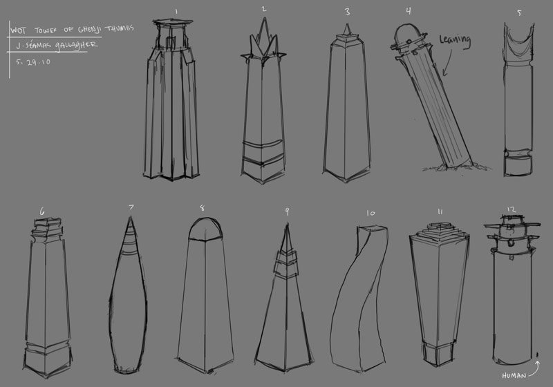
Click to enlarge
I thought all of them are neat ideas. We developed several different ones, but the one I latched onto the most was number 2. Tess and I had a follow-up call with Seamas and we asked him to do some studies on the angular nature of the Tower. I gave him some spsecific direction and ideas, and he went back to do more revisions. Here’s some of the stuff he sent us:
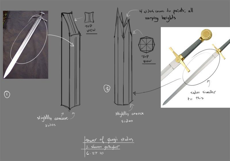
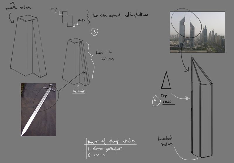
Click to enlarge
With some final direction provided to him, Seamas put together this proposed sketch for the final Tower design.
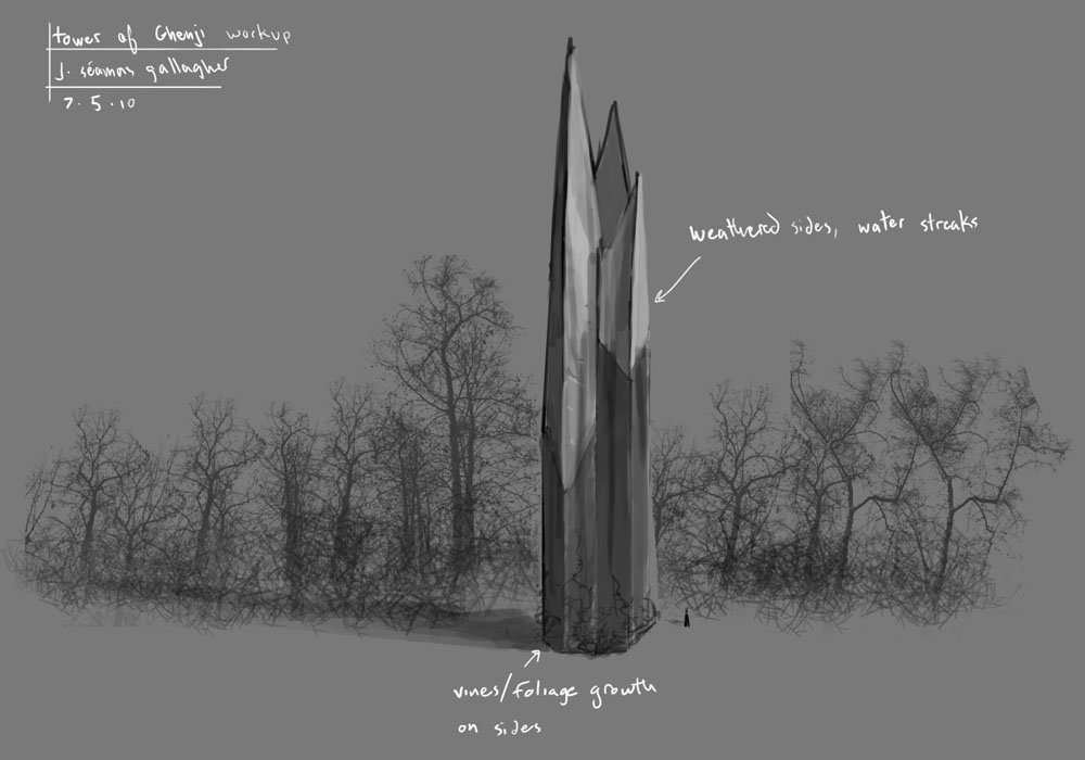
Click to enlarge
I gave it my stamp of approval, and we got ready for phase two.
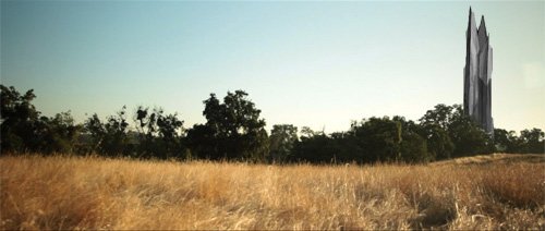
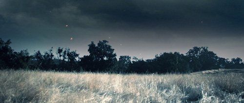
After we completed filming, the next challenge was to take Seamas’s Tower design and place it into the actual footage. We provided him with a background “plate” (a JPEG exported out of the actual video clips we’d shot) and he “painted” his Tower on top of it using Photoshop. His Tower was then exported out to our vfx artist, who composited it on top of the video. Once that was in place, I applied some more color correction, and it was done.
Here’s a visual breakdown of the process:
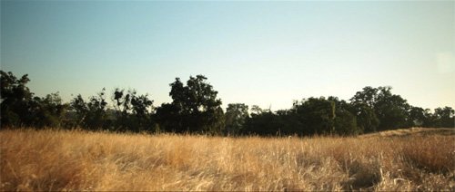
Original plate from our footage
Mock-up of the Tower composited on top.
Modified plate with other visual effects in place (clouds, ash, etc)
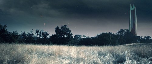
Final Tower design composited on top. Note the improved blending with the trees.
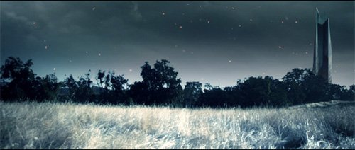
Final image from the book trailer. Includes additional color correction
There were far more visual effects than just the Tower of Ghenji, of course. Almost every shot in the book trailer had some kind of visual element added. Falling ash, stormy clouds, and weaves of saidar all had to to be designed, created, and composited in. For this task, we turned once again to Marlon Torres, the same person who had been our Director of Photography.
If you appreciated the overall visual quality of this book trailer, it’s due in large part to Marlon’s extreme talent. As the DP and vfx artist, he clearly demonstrates that pretty much every pixel on screen is there because of his efforts. If you really liked it, then head over to his website and let him know. And while you’re there, encourage him to read the first book in the series.
Marlon took my notes and created most of the visual effects you see in the final book trailer. I believe he used Adobe After Effects for the compositing. The stormy skies were taken from actual cloud footage, but sped up for dramatic effect. The ash came from stock footage I acquired for this project. The saidar weaves were based off of a simple design I did, but ultimately made to look awesome through Marlon’s work.
After the movie was complete, he worked on this video, to demonstrate some before and after images.
(Note: The images seen in this video aren’t exactly the same as the ones in the final book trailer. Marlon added a somewhat different style of visual elements to showcase on his portfolio than what ended up in the finished movie.)
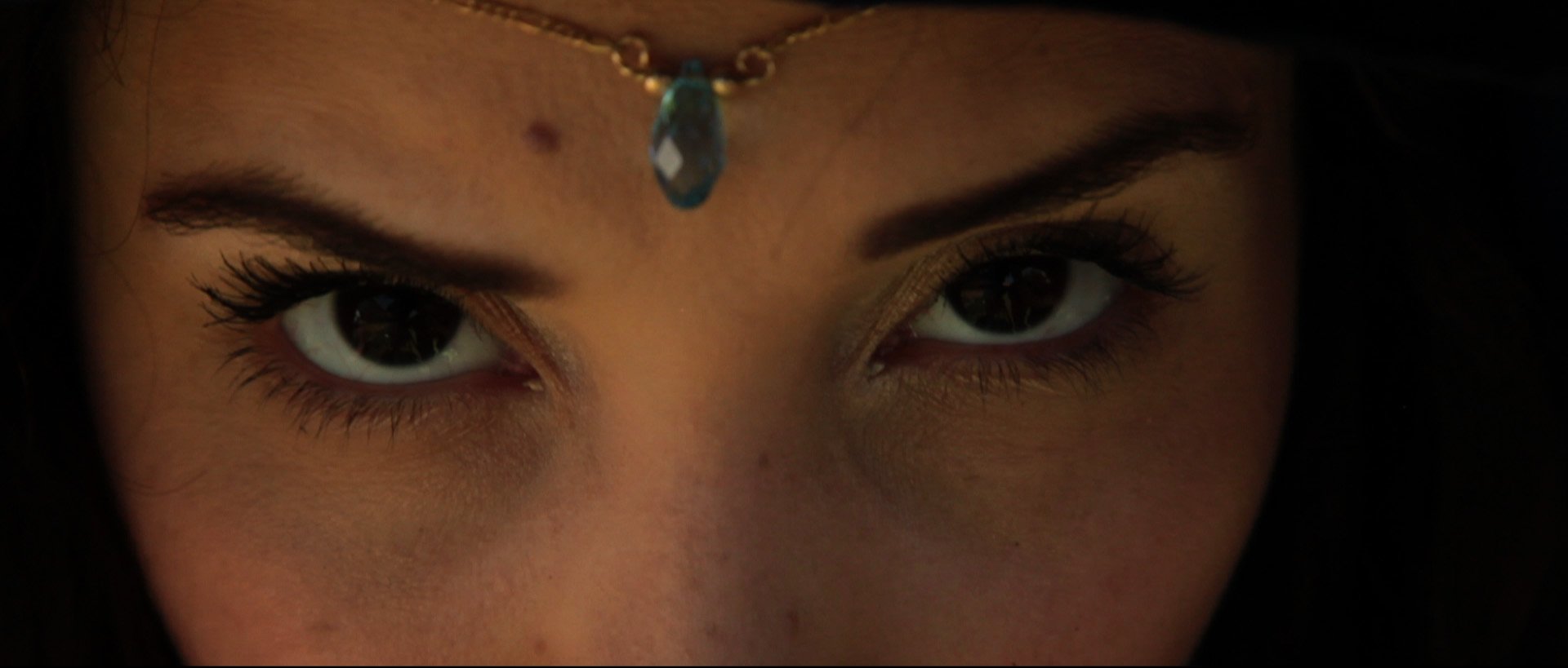
Something I’d really like to talk about are Sarah’s eyes. Robert Jordan never specifically desribes Moiraine’s eye color. He describes them as being “dark pools”. I was plannig to do a close-up shot of Moiraine’s eyes as her grand reveal in the trailer, so I knew her eyes had to be spectacular. Well, it turned out that Sarah has these incredible naturally dark eyes. They’re so dark that you can hardly tell the difference beetween the iris and pupil. Take a look at this un-modified still-frame that we shot during production, and the final image from the film. This shot was worked on by Darby Edelen, and I couldn’t have been more pleased.
Orignal plate. Note Sarah’s naturally dark eyes. (And the camera operator reflected in them!)
Click to enlarge.
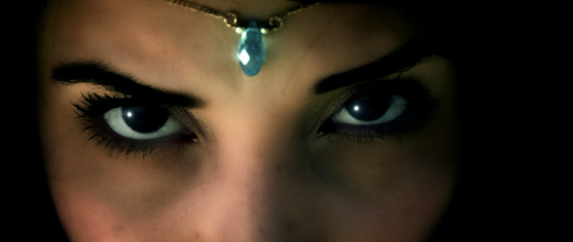
Final still frame for the film. Notice how we removed the camera operator and added specular highlights.
Click to enlarge.
<< Previous Page: Editing | Next Page: Sound & Music >>
-
Stay Connected


-
-
-
The Wheel of Time Books
- 2. The Great Hunt
- 3. The Dragon Reborn
- 4. The Shadow Rising
- 5. The Fires of Heaven
- 6. Lord of Chaos
- 7. A Crown of Swords
- 8. The Path of Daggers
- 9. Winter's Heart
- 10. The Crossroads of Twilight
- 11. Knife of Dreams
- 12. The Gathering Storm
- 13. Towers of Midnight
- 14. A Memory of Light
- New Spring (prequel)
- The Strike at Shayol Ghul (short)
- River of Souls (short)
- A Fire Within the Ways (short)