Jump to content

DRAGONMOUNT

A WHEEL OF TIME COMMUNITY

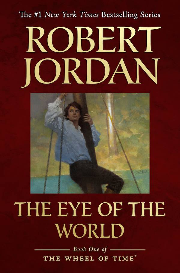
New cover artwork for US editions


Jason Denzel

For the first time since their original publication, the first three Wheel of Time novels will be published with new artwork on the covers.


Tor Books announced today via Tor.com that The Eye of the World, The Great Hunt, and The Dragon Reborn will be re-released in trade paperback form with new cover designs.


From Tor.com:

As Harriet MacDougal and Brandon Sanderson work to complete A Memory of Light, the final volume in the series, the timing is perfect for millions of Wheel of Time fans to go back to the very beginning, when five kids from Emond’s Field had little idea of what lay ahead. Whether you’ve read the series once, a dozen times, lapsed after book eight, or are just coming to it fresh for the first time, these new editions are a perfect jumping off point for a fresh readthrough.


The new editions will be released this summer, beginning with The Eye of the World in May, followed by The Great Hunt and The Dragon Reborn in June and July, respectively.


Each cover features artwork originally introduced for the eBook editions. Check our eBook Gallery for the complete set of covers.


So, what do you think? Will you pick up these fresh copies for your latest re-read? They make great gifts for friends who would appreciate a good story and compelling modern book covers.


User Feedback

Recommended Comments


Shawnchan, I can assure you that Jenn was being honest when she said the moderation log showed nothing. Had you said something inappropriate, we would have given an explanation along with a deletion or edit. We understand that not everyone is going to have the same opinion of the covers.

Share this comment


Link to comment
Share on other sites

Just been pwerusing my paperback originals (uk editions of course) TEOTW is superb and gets into the feel of WOT. ACOS conveys something of the darkness besetting Rand. POD is just good artwork for an army on the March. The rest are pretty pedestrian and in the uk even the hardbacks stopped having artwork from book 10 onwards. So maybe I was being a bit mean when I said I was underwhelmed with the new artwork.

However, this was an opportunity to go for gold and I think we may be lucky to get bronze.

If only they were of the qualty of TGH. The trollocs for the first time look guenuinely scary and would certainly send shivers up and down my spine. Let's hope that someone gets a Myrrdrahl to have the same effect!!

what is your fav jacket folks?

Share this comment


Link to comment
Share on other sites

I love the new covers! They look beautiful. Such an improvement over the previous artwork! I know that the guy who did the old covers wouldn't be pleased to hear it, but different projects require different collaborators. The guy who did the old covers also did the covers for Piers Anthony's Xanth series; in that case, the artist's style was a perfect match for the overall tone of the series (humorous and often silly).


I think the new covers have a well balanced design in terms of border, font style and size, artwork and background. They are elegant. Well done to the designer and artist.


.

Share this comment


Link to comment
Share on other sites

Oh, and I think a calendar with larger prints of the paintings is a great idea! I'd buy one.

Share this comment


Link to comment
Share on other sites

These covers appear very underwhealming. For instance book one has what looks like Elijah Wood a-hobbitting apon his tree branch but what must be Matrim Cauthon on a boat (posing for Thom?)whilst it sails past the Tower of Ghengei? How does this and the other covers end up in attracting new readers shopping instore or online amongst a plethora of many other canons and their authors all struggling to reach their story out to the buyer. The Sweet Eye of the World cover reached out and grabbed me the first time I saw it, so much so that the picture of Moiraine along with how Jordan writes her reminds me of Kate Mulgrew, and I use her voice when reading Moiraine. When I read that there were new covers I shuddered at the memory of some of the later ones from the series, ones that looked like Mills and Boon romance titles. I hoped we would not see a repeat of that. Yet this first cover does little to alter that perception.

We, or you, are faced with the fact that compared to UK/AU/NZ titles, taste seems to go out of the window with the dishwater when it comes to many US dustcovers. Garish, bold lettering and awful imagery are frequent unwelcome guests on US edition covers. Case in point are the first editions of the US Lord of the Rings books compared to the UK ones. Tolkien found them ghastly and compared to the UK ones they do leave much to be desired. I think these new WoT covers need reviewing. I think sales wil be a deciding factor in whether they keep them or move the books on to something better. Eye of the World in particular, by it's very nature and it's position in the canon needs a complete change. What is it you americans seem to say often these days when finishing a comment online? Ah yes, thats right: "I'm juss sayin'.".

Share this comment


Link to comment
Share on other sites


Join the conversation

You can post now and register later. If you have an account, sign in now to post with your account.
Note: Your post will require moderator approval before it will be visible.

Guest
Unfortunately, your content contains terms that we do not allow. Please edit your content to remove the highlighted words below.
Add a comment...

×   Pasted as rich text.   Paste as plain text instead

  Only 75 emoji are allowed.

×   Your link has been automatically embedded.   Display as a link instead

×   Your previous content has been restored.   Clear editor

×   You cannot paste images directly. Upload or insert images from URL.


×
×
  • Create New...