


Adam Whitehead is Dragonmount's TV blogger. Adam has been writing about film and television, The Wheel of Time, and other genre fiction for over fifteen years, and was a finalist for the Hugo Award for Best Fan Writer in 2020. Be sure to check out his websites, The Wertzone and Atlas of Ice and Fire (including The Wheel of Time Atlas!) as well as his Patreon.
It’s a sign that Wheel of Time news has been a bit thin on the ground recently when fans get incredibly excited about the reveal of the TV show’s official logo.
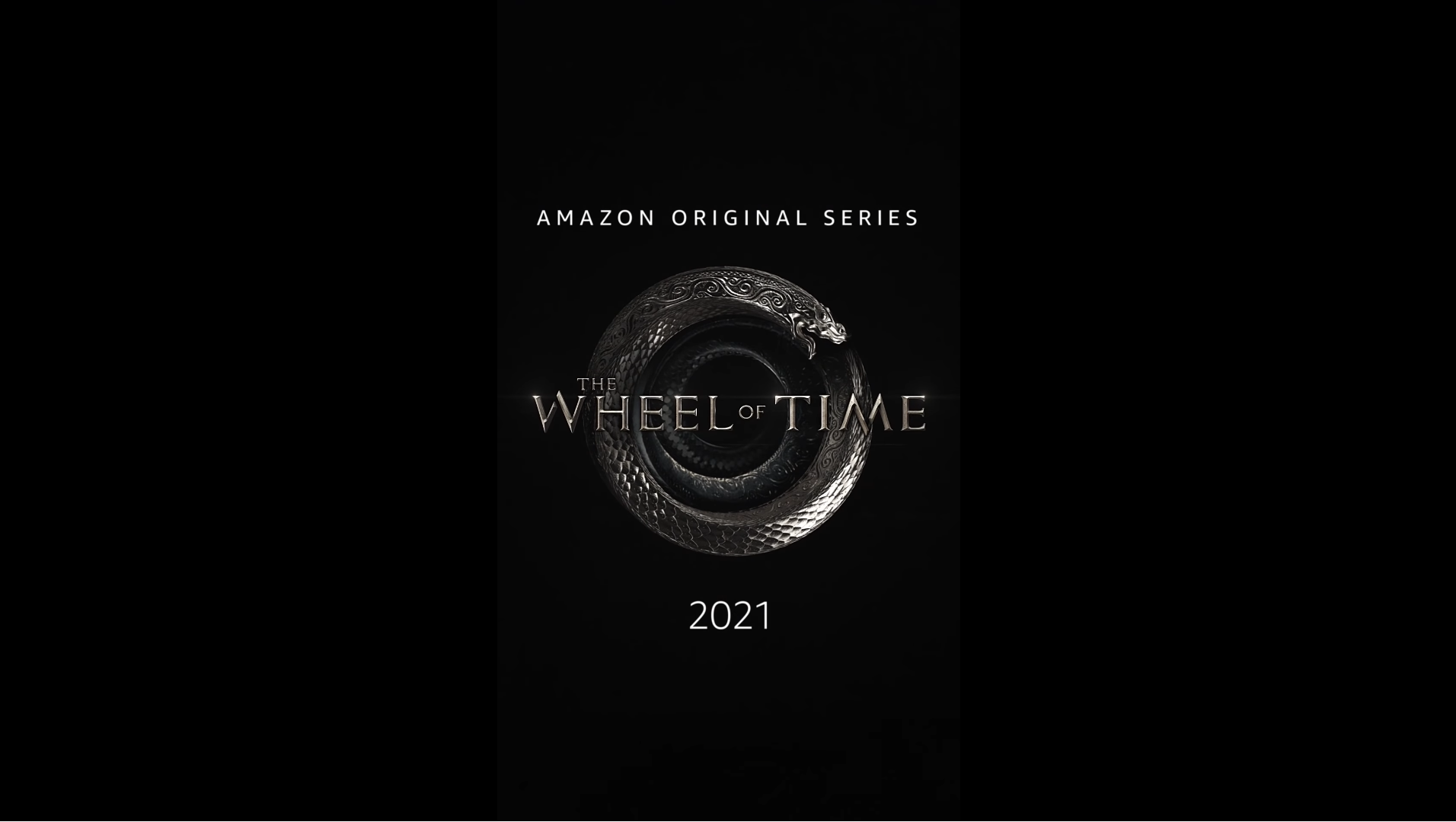
Up until now, Amazon has been using a derivation of the logo from the novels. However, it was clear that they’d want to create their own logo to easily differentiate the TV series from the books, the tabletop RPG and other takes on the same franchise, and they could put on their own merchandise.
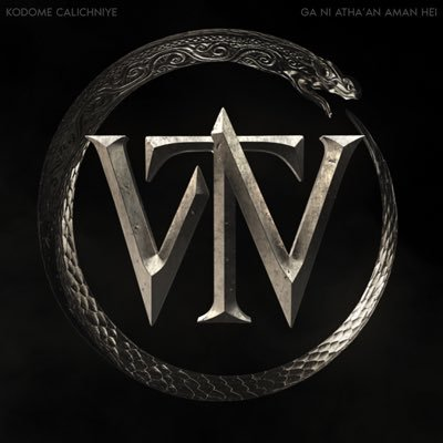
Intriguingly, they’ve decided not to include a literal Wheel in the image. Although they might be an obvious choice, it might also feel a little too on-the-nose. Instead, the primary image in the logo is a variation on the ouroboros symbol, of a snake eating its own tail. In mythology, the ouroboros is a serpent eating its own tail, a symbol for eternity. It is also used to depict alchemy and the cycle of life, death and rebirth. The symbol is Egyptian in origin (one adorns the tomb of Tutankhamun, dating from c. 1323 BC) before being picked up on by the ancient Greeks, who massively popularised its use. It also later appears in Norse mythology as the World Serpent, Jörmungandr, and in the Bible as the Leviathan. Variations on the image also appear in Hinduism. All of these sources were used by Robert Jordan during research for the Wheel of Time novels.
In The Wheel of Time novels, the ouroboros is depicted as the Great Serpent, a symbol of eternity even older than the Wheel itself. Aes Sedai wear a Great Serpent ring to depict their rank and status, and the Great Serpent is sometimes used as a metaphor for time in lieu of the more familiar Wheel.
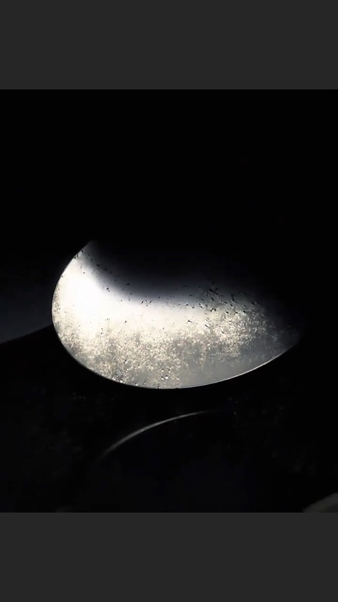
More careful examination of the logo and its animated opening shows the scales initially being contrasted between light and shadow, forming a representation of the Aes Sedai symbol. The Aes Sedai symbol is, of course, the yin and yang symbol of Chinese philosophy. The yin and yang represent dualism, the idea of how opposite and contrary forces may actually be complementary and even interdependent. This is a key theme of the series where the dualism of male and female, order and chaos, and good and evil are core ideas. At the start of the books the two are separated out, with the white symbol being presented as the Flame of Tar Valon, standing for order, female power and good, and the black symbol being presented as the Dragon’s Fang, standing for chaos, male unpredictability and evil (a result of the male half of the One Power being cursed, dooming male channellers to insanity and death even as the fate of the world hinges on the success of one of them, the Dragon Reborn). This is actually the inversion of the traditional Chinese use of the symbol, where yang is white and yin is black. The traditional Chinese version of the symbol also has a tiny dot of white in the black half and vice versa, to show that nothing is entirely one way or the other; Jordan omitted this possibly to make the symbol less immediately obviously the same thing as the yin and yang.
The ring itself is also interesting, as it is made up of a serpent that coils downwards to infinity. This hints at the other worlds/dimensions that come to play a major role in the story. The surface of the ring is also rippled and coils back in on itself in unusual ways, like a Möbius strip. Such a strip is unusual in having only one side and one boundary, meaning that though it appears to have two sides, it only has one, the result of an elaborate optical illusion. The Möbius strip is sometimes used in science fiction and fantasy to represent matters related to non-linear time; Avengers: Endgame visualises its time travel technology with a 3D holographic version of a strip (which gives Tony Stark the clue he needs to make time travel possible).
Eagle-eyed fans also caught that the logo has messages in the Old Tongue – the language of the Age of Legends – hidden in the corners. “Kodome calichniye ga ni athan’an aman hei” means “here is always a welcome for the People of the Dragon.”
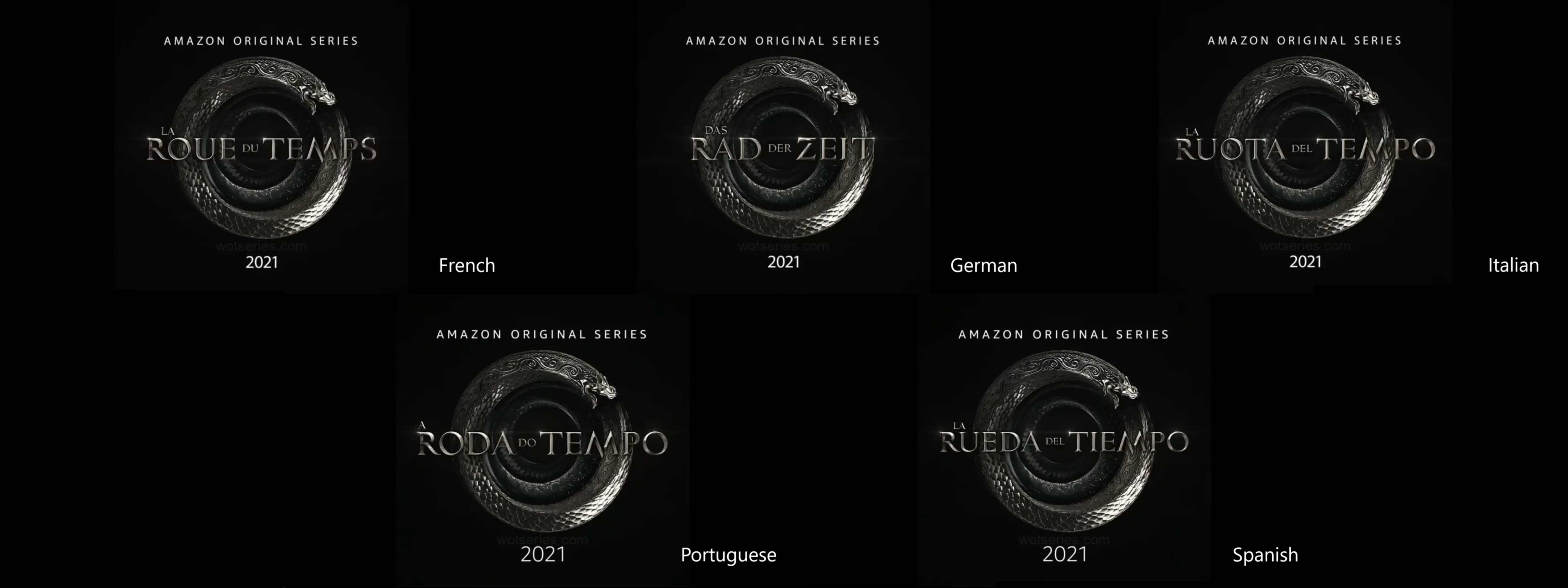
Amazon also revealed variations of the logo in Spanish, Portuguese, Italian, German, French and Japanese, as well as a scaled-down version of the logo using the major initials “WT” (rather than the more common fan-abbreviation “WoT”).
The unveiling of the logo is possibly the start of a more concerted marketing push for the series, which as we speculated last time may launch in November (and the logo reveal does confirm a 2021 release date). In an intriguing development, the release of the TV tie-in editions for the Wheel of Time novels has moved up to 16 September in the UK, 28 September in the USA for the mass-market edition and 5 October for the trade paperback edition. Although these dates seem to be in flux and should be treated with caution, it may hint that Amazon is now considering an earlier launch for the show, in October or early November, rather than the previously-hinted late November/December launch date.
Hopefully in the next few weeks we’ll see a full trailer and start seeing things spooling up for the show’s long, long-delayed launch.
As usual, let us know your thoughts and keep checking our TV news and casting pages for updates.


Recommended Comments
Join the conversation
You can post now and register later. If you have an account, sign in now to post with your account.
Note: Your post will require moderator approval before it will be visible.