Jump to content

DRAGONMOUNT

A WHEEL OF TIME COMMUNITY

Darrell K. Sweet's Unfinished Cover for A MEMORY OF LIGHT


Jason Denzel
  • <p><p>Check out <strong>Darrell K. Sweet's</strong> unfinished cover art for <em>A Memory of Light</em>.</p></p>


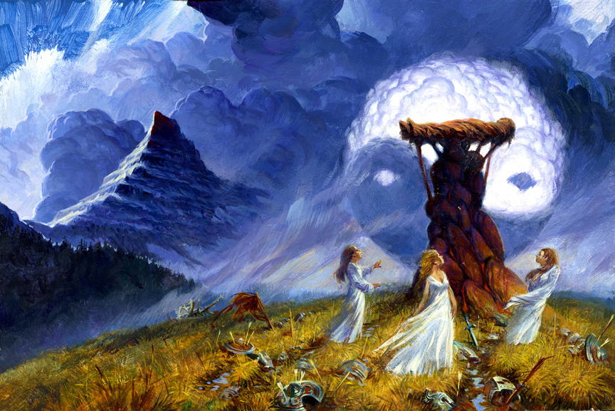
Check out Darrell K. Sweet's unfinished cover art for A Memory of Light.


Most fans are aware of Darrell K. Sweet's artwork, which graces the covers of the original U.S. edition Wheel of Time books. Regardless of what you think of the art itself, Mr. Sweet's imagery has become a recognized style deeply associated with the series.


Unfortunately, Mr. Sweet passed away before completing the book cover for A Memory of Light, the final book in the series. But this weekend at JordanCon 2012, we've been given the opportunity to see his first draft of the painting.


Click here or on the image to the right to see the full version.


In my personal opinion, I think this painting had the potential to be one of the finest in the series. Try and see past the obvious mistakes or omissions. The three women (presumably Elayne, Min, and Aviendha) would need some articulation to distinguish themselves from each other, and the "yin yang" isn't accurate. But those are the kinds of adjustments that Darrell would have made. It's been part of the process since the series began. While the details aren't accurate to the book, per se, this painting invokes some powerful emotions for me. I think we can all guess whose body that is at the top of the funeral bier!


With Mr. Sweet's passing, the final book cover will be painted by renowned artist Michael Whelan. Mr. Whelan is hard at work on the painting at this time. He will not be painting the same scene as Mr. Sweet. Be sure to follow our news, Twitter, or Facebook pages to see when that cover is revealed.


So, what do you think of this unfinished cover? Critical comments are welcome, but please keep things respectful at all times.

A Memory of Light will be released in hardcover and audiobook on January 8, 2013. Read the full details here.


User Feedback

Recommended Comments


I wonder if hes on the remains of the greenman oak? As cover goes, might b the best (too bad wont b finished)

Share this comment


Link to comment
Share on other sites

Would TOR consider a reversible cover, I wonder? As opposed to putting Sweet's cover where the map is..So then if people prefer Sweet's version, they can just flip it. This may be inconvenient for the publishers, but I have seen it done for films (e.g. Bicentennial Man VHS).

Share this comment


Link to comment
Share on other sites

With all respect to Michael Whelan, they should have gone with this one, as is. I think the fans are old enough to handle a rough draft on the cover.

Share this comment


Link to comment
Share on other sites

They seriously could not get someone better to do the last and final book cover? I never could stand Sweet's covers - it makes everyone look like they are way older than they are supposed to be besides being extraordinarily bland. If I had been one to judge based on the covers of books, I would never have picked up the Eye of the World based on Sweet's spiritless artwork.

Share this comment


Link to comment
Share on other sites

This picture reminds me of the Two Rivers girls dancing around the spring pole at Bel Tine. Only more tragic.


If i remember correctly Rand thinks to himself that no one knows when th the tradition started and that was another thing that had always been that way. Maybe a skewed tradition from a distant age before Lew Therin even?

Share this comment


Link to comment
Share on other sites

I'm really excited about the Whelan cover for AMoL, but I really hope they also include this as an inner panel (like they did with the earlier EotW cover). Who do we have to persuade to make this happen?

Share this comment


Link to comment
Share on other sites

I love this cover except for one thing. The symbol... The dragon's fang and the flame of Tar'Valon are not thie same and the Yin and Yan. The two opposing dots should not be there but Its small enough that I could live with it. I thing Sweets art deserves to be on the cover.

Share this comment


Link to comment
Share on other sites

This is a great draft for cover espically compared to the last few covers. Maybe it could be incorporated into the inner cover like with the eye of the world hard back edition that carried the alternative cover art inside.


Apart from that - this picture throws up some interesting scenario's relating to the "blood on the rocks of Shayol Ghul" prophecy. Could his funneral byre be built from the rocks of Shayol Ghul?

Share this comment


Link to comment
Share on other sites

It's a good painting but it seems to me like it reveals too much, given the type of battle debris. I wasn't really a fan of the Lord of Chaos cover because it told you what was going to happen during a battle (of which there was only one in the book), and to be honest it's the same thing with this one unless it's all non-stop fighting so you can't easily predict where it will happen while reading.

Share this comment


Link to comment
Share on other sites

I've never liked any of the Sweet covers much, but I have to say this is by far the best of the bunch, even unfinished. A shame it wasn't finished. Would be nice if they put it on the interior of the cover, replacing the map or something.


I was about to write something when I realized that you did all the work for me. These are the exact words I was looking for... Totally agree with you pal!

Share this comment


Link to comment
Share on other sites

Wow. It is truly a shame that Darrell Sweet was unable to complete this. The details and any mistakes would have been fixed before the final version.


Thanks for posting this. It is one of Sweet's best paintings, even in rough draft form. I have faith that Michael Whelan will do justice with his painting for AMOL.

Share this comment


Link to comment
Share on other sites

Definitely NOT a fan of the Sweet covers (other than tEotW, and maybe Path of Daggers) but this one looked like it was going to be good. Too bad.


I'm a huge fan of Michael Whelan's work though so I won't be disappointed with that for sure. Only artists I would have liked more are Donato Giancola or Dan Dos Santos (who are fantastic and did my two favorite of the WoT ebook covers).

Share this comment


Link to comment
Share on other sites

Never really been impressed by Sweet's figures. The postures are always just slightly off and not in an auteur way, just consistently inaccurate and disproportionate. His colors are usually vibrant, although the palate as a whole isn't always digestible or cohesive.


poots

Share this comment


Link to comment
Share on other sites

doh i always hoped rand would make it through the last battle. Nnayeve always saying that she was determined to heal someone from the dead etc i was sure that was gonna be Rand on the slopes...

guess not.

massive spolier??!!! or is it?

Share this comment


Link to comment
Share on other sites

This picture reminds me of the Two Rivers girls dancing around the spring pole at Bel Tine. Only more tragic.


If i remember correctly Rand thinks to himself that no one knows when th the tradition started and that was another thing that had always been that way. Maybe a skewed tradition from a distant age before Lew Therin even?


That is a pretty interesting perspective.


I am bummed that this cover will not be improved an released. To get so close and not finish seems to be a curse with this series.

Share this comment


Link to comment
Share on other sites

First time I saw the painting, I said it's already a masterpiece, considering it's unfinished. I also thought, "Light, what's wrong with the painting?" I mean, it's brilliant that Sweet chose this scene to depict for the conclusion of THE WHEEL OF TIME. (Emotional it is, Rand, finally overcoming what he's destined to become; brought tears to my eyes.) All it needed now is a good editing eye, give to Michael Whelan to finish, and there... the grand finale of the epic fantasy we've all been anticipating.


I just don't know about Whelan not painting the same scene as Sweet. I'm a big fan of Michael Whelan, really; he's almost like Darell K. Sweet in notoriety, and he's provided artworks for most of my favorite sci-fi and epic fantasies. But it pains to know that this painting will not grace the cover of "A Memory Of Light" anymore. BitterSWEET indeed; and how ironic for Mr. SWEET...


But whatever's got to happen, has got to happen. Whether or not this painting will make it to the cover of the final book, TOR, McDougal & Sanderson will have my full support & appreciation. And that's Michael Whelan who's taking over Sweet, right? I mean, Michael Whelan! That, at least, is a consolation.

Share this comment


Link to comment
Share on other sites

The Wheel of Time turns, and Ages come and pass, leaving memories that become legend. Legend fades to myth, and even myth is long forgotten when the Age that gave it birth comes again.


http://ouranou.net/wheel.jpg

Share this comment


Link to comment
Share on other sites

i dont know about accuracy as far as the symbol goes but there are some powerful images there.


the funeral bier in itself

the way the the ancient symbol calls eyes to mind

Note the mountain in the left."his blood on the slopes of shayol guhl"..

The broken sword on teh ground at the base.

And finally the women presumably min aviendha and elayne dressed in mourning white


so may things there and thats at first glance. wow

Share this comment


Link to comment
Share on other sites

I've always hated Darrell K. Sweet's covers. I've never understood how a commercial artist could have such a long, successful career without being able to draw humans. He produced some beautiful backgrounds, his composition was generally good, and he had some truly awesome concepts, but he drew really, really crappy people. Not only was his perspective weird, but his proportions were just flat wrong, and he had real trouble drawing hands.


What's with all the women with vapid looks on their faces fluttering their weirdly tiny hands about, and why is most everyone standing or sitting in strained, unnatural poses? Why does Rand look like a completely different person nearly every time he appears - and not in a way consistent with the story, but as though one model was switched out for another? In the two where he actually looks like the same person, he resembles the late character actor J.T. Walsh, which I can't imagine is the way anyone envisions Rand.


And, of course, there's always Perrin as Gimli the Dwarf (WH and KoD) and pissy-powerwalker Rand (CoS), along with Mat as an Indian brave in a Zorro hat. The worst, I think, was the cover of LoC, which was simply god-awful in every possible way.


I wish Michael Whelan had been the artist for all the covers.

Share this comment


Link to comment
Share on other sites


Join the conversation

You can post now and register later. If you have an account, sign in now to post with your account.
Note: Your post will require moderator approval before it will be visible.

Guest
Unfortunately, your content contains terms that we do not allow. Please edit your content to remove the highlighted words below.
Add a comment...

×   Pasted as rich text.   Paste as plain text instead

  Only 75 emoji are allowed.

×   Your link has been automatically embedded.   Display as a link instead

×   Your previous content has been restored.   Clear editor

×   You cannot paste images directly. Upload or insert images from URL.


×
×
  • Create New...